What is ranking (visibility) in GSС reports and how to analyze this metric
Google Search Console does not contain direct charts and data that show the visibility of a website in SERPs. You can independently build hypotheses and search for data to confirm hypotheses, or you can use the appropriate dashboard for analysis in JetOctopus. In this article, we will tell you how this dashboard is built and how to use it to gain insight and optimize your SEO strategy.
Ranking (visibility) metric: what is it
You can find the “Ranking (visibility)” chart in many dashboards in the Google Search Console section. In particular, such data is available in the dashboards “Overview”, “Countries”, “Keywords Group”. Basically, this ranking (visibility) chart shows how many pages are ranked in the SERP for the selected period. Pay attention to the fact that all data is taken from the Google Search Console. This is the most accurate and reliable data about how your website is present in Google.
You can overlay the ranking (visibility) data on the positions, and you will understand how organic traffic depends on the visibility of the website (the presence of the page in the search results) and the position. After all, the fact that your website is in SERP does not mean that it will bring traffic.
Many factors play a role here: the quality of the snippet, the authority/fame of the brand, the relevance of the query, etc. Many of these factors can be influenced by SEO specialists, for example, by split testing to identify the most clickable snippet. Or analyze the pages with the highest bounce rate and understand which pages did not contain the information that the user was looking for.
Let’s go back to the chart. In the chart you will find two lines: ranking and pages. The pages line shows how many pages were shown in SERP. The ranking line shows how many queries your page was shown in search results. What is meant here? One page can be displayed in SERP several times. For example, when a user searches for “chart rankings JetOctopus” and “visibility chart JetOctopus”, the same page will be shown in the results, because the user is searching for information about the same chart with different queries.
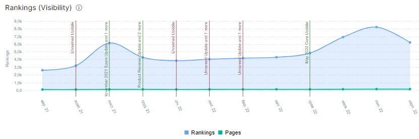
You can select the desired period, device type and country at the top of the page.

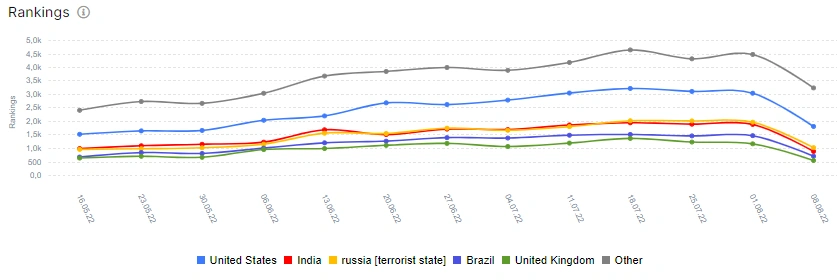
For a detailed analysis of rankings in different countries, go to the Country dashboard. There you will see in which countries your site is most popular. That is, for which countries Google showed the largest number of pages of your website in the search results.
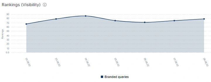
The ranking diagram in the Keyvods Group dashboard works according to a similar principle. Click on the desired group of keywords to see how many pages (with the corresponding keyword) were shown in Google for the period you selected.

And this is what the diagram looks like. You can see that the effectiveness of the keyword group is decreasing.
Finding insights: what the “Ranking (visibility)” chart data says
With the help of data from the “Ranking (visibility)” chart, you can get a lot of insights if you delve into a deep analysis. Each website has its own specifics, which must always be taken into account. For example, a sharp drop in the number of pages in the SERP may indicate technical problems on the site (the website was closed from indexing) or a change in the promotion strategy (you started a TV advertising company and everyone wanted to know about your website, and after finishing it the motivator to search your website is gone). Also, the reason may be an update of Google algorithms.
Always take this specificity into account. What to pay attention to? How to get insights with “Ranking (visibility)” chart? We have several ideas.
1. Compare the data on the “Ranking (visibility)” chart for different devices. Statistics show that more and more users are using smartphones to search the Internet and shop. Therefore, pay attention to which devices are ranked more pages. If you are an e-commerce business and the results are better for desktop, consider optimizing your website for mobile devices: Core Web Vitals, performance, Time to Interaction. These and other indicators are important when ranking pages.
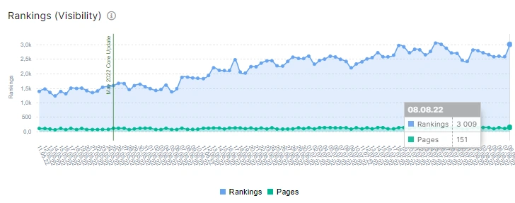
Here is the desktop:
Here are the smartphones:
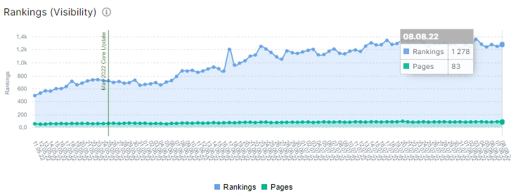
The difference is noticeable, right? Only 83 pages foe mobile smartphones and 151 pages for desktop.
2. Choose focus countries with the best ranking indicators. Does this data match the amount of traffic you receive from each country? Which countries can potentially bring traffic because they have good ranking indicators with a high bounce rate because you didn’t take them into account in your local optimization?
3. What about the timeline with the releases of seo tasks and breakdowns on the website? How does the ranking change depending on the release? How has a certain error affected your website? By the way, the less impact an error has on your website’s ranking, the better your user behavior is likely to be. People like your website so much that they only want to click on it from search, so Google has to show slightly broken pages in search results. But you should not abuse it, because in the event of breakdowns, the ranking will still decrease.
4. Split testing. Of course, if you have split testing, you need to track a lot more data. But with the “Ranking (visibility)” chart you can see the general dynamics. Here you can also add tracking of the impact of SEO optimization. What does it mean if the number of pages in the SERP increased, but the conversions did not? Need to explore!
5. Correlation between pages and ranking. These are the two lines that are displayed on the “Ranking (visibility)” chart in the “Overview” dashboard. Usually the ranking line is much higher, and the pages are lower. And why does it happen that these indicators are almost the same? Maybe you should pay attention to the content. Thin content can be the cause of such a situation.
Try adding position and conversion data to understand how your website is performing in Google.
You may be interested in: SEO Visibility – 6 Reasons for Search Visibility Loss and How to Fix It?

