
Insights from GSC: how to use this dashboard to create an SEO strategy
When creating an SEO strategy, it is important to understand the general trends on the website, its strengths and weaknesses. Which URLs bring the most traffic? How does it relate to the position of the page in SERP? Does the query matter? Many questions arise, the answers to which you can find in Google Search Console. However, manually creating tables and charts is quite laborious and takes a lot of time, so we created a special “Insights” dashboard in the GSC section. There you will find many interesting charts that will help you understand how your website works in SERP.
To begin, select the desired period, country and device because the results can be very different for mobile and desktop, for the USA and European countries, depending on the on-page optimization.

You can also select the segment for which you want to see charts with insights.

More information: How to use segments.
Clicks by Position
The “Clicks by Position” chart shows how many clicks pages had on the first, second, etc. positions.
Please note that we do not calculate the average position for the page, but the position of the page for each query. This allows you to see more accurate data.
For most websites, the situation will be the same: the pages in the first position, then the second and third, will have the most clicks.
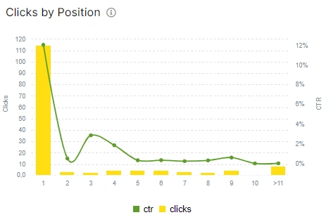
But we want to draw attention to CTR. Pages in the first position will not always have the best CTR. It is also possible that a page in position 3 will have a lower CTR than a page in position 5. It is important to understand the reasons. Analyze pages and queries for each position. Click on the required column to go to the data table. All columns in the charts are clickable.
Take this data into account when creating your SEO strategy. Boost pages that rank well but have low CTR.
Rankings by Position
The chart “Rankings by Position” shows how many pages are ranked in the SERP in the first, second, etc. positions. By comparing the first and second charts, you can understand how effective the pages are in different positions.
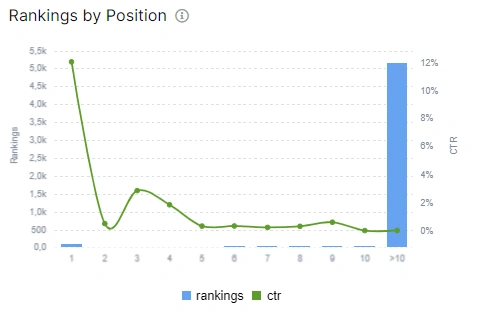
Also pay attention to CTR.
When planning your strategy, choose a set of pages that you will optimize first. For example, if the pages in the first positions bring you the most clicks, you can optimize the URLs on the first page of the SERP to increase positions.
Queries performance counts by words
Another very interesting chart that will help determine the most efficient queries. Here you will see the relations between the number of words in the query and CTR. As you can see on the chart, single-word queries have the highest CTR. That is, the query “jetoctopus” has more clicks than “jetoctopus log analysis”.
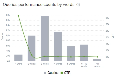
We recommend focusing on each type of query. You can use this data when planning page optimization. For example, queries with a large number of words can be info queries (how to make an order, how delivery works etc.) and have high potential. It can also be specific product names, and if these pages will have the first or second positions, then you are guaranteed to get conversions.
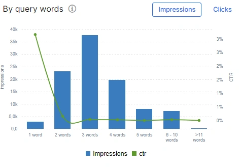
To supplement the information, we recommend analyzing the data from the “By query words” chart. Here you can select what you want to analyze: dynamics of clicks or impressions.
Active pages by groups
The chart “Active pages by groups” shows the relations between the number of pages and clicks. The first column shows the number of pages that had only 1 click during the period you selected. The pages with the most clicks usually bring the most conversions.
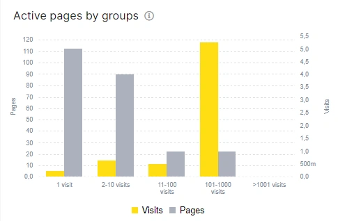
You can see in the screenshot that the number of most clickable pages is small. There are two ways you can go when planning your strategy: focus on increasing the number of clicks for pages that have 1-2 clicks, or optimize pages that already have enough clicks to increase your CTR even more.
Top queries by clicks
A simple and clear table that shows the top queries with the largest number of clicks. These are the queries that bring the most traffic. You can continue to optimize pages that rank for these queries.

These charts will help you answer the most important questions before you start creating your SEO strategy:
- which pages are the most efficient;
- what impact do positions have on traffic;
- does the top position mean the most traffic and so on.

