Chaos may be a ladder to growth, but it’s not something you’d want on your website. A poorly organized website — one without a proper website architecture — won’t just form a bad first impression on visitors, but also lead to a higher bounce rate and ultimately, kill conversions.
So, it’s vital to structure your site in an easy-to-navigate way to better retain your audience. If people leave your website because your user experience (UX) is confusing or unintuitive, search engines like Google won’t rank you high, either.
SEO-friendly website architecture is especially important for eCommerce websites, considering how a typical eCommerce website can have hundreds to thousands of pages (products, categories, blog, etc.).
So while this post will cover website architecture best practices (along with expert tips) that are applicable to all websites, we’ll have some focus on eCommerce websites in particular.
But first, let’s start with the what and why of website architecture.
What is Website Architecture?
Website architecture is essentially the hierarchical structure and organization of your web pages. It’s about designing your website’s information architecture in a way that bolsters usability.
The structure of a website is created by internally linking the various pages in a way that helps:
- Users easily find the content they want
- Search engine crawlers establish the relationship between those pages
Once you map out your website architecture design, the site structure is further refined using elements like breadcrumbs, URL structure, pagination, etc.
We’ll cover all that in more detail, but what do we mean by website information architecture?
Site Architecture vs Website Information Architecture
You know the website architecture definition, but how is it different from website information architecture?
Both terms are often used interchangeably, but information architecture (IA) is a broader term that refers to the structure of information (content, context, audience, etc.). Website architecture is a subset of IA that’s all about websites (navigation, structure, etc.).
So the biggest consideration when defining your website information architecture is to build one that’s organized, logical, and easy to navigate. You don’t want an architecture that enforces unnecessary clicks to reach pages.
Why is Website Structuring Important?
A well-crafted website structure is like a tree graph.
The homepage is the root. From this root, pages (such as Blog, About, Services, etc.) link out like branches, and those pages may have additional branches sprouting from them. These branches then link to each other.
Website structuring plays an important role in both search engine optimization (SEO) and customer conversion.
Importance of Website Architecture for SEO
Most websites have some level of website architecture defined.
But for medium-to-big, enterprise eCommerce websites with thousands of pages, even a slightly disorganized website architecture can lead to a lot of issues over time, such as:
- Hard to find products
- Dead pages that return 404 errors
- Mislabeled categories
- Too many unnecessary redirects
- Duplicate content
- And more
To properly rank websites, search engine crawlers need to extract context from hundreds to thousands of pages in order to figure out if the website is a major business publication, a lifestyle magazine, or an eCommerce store.
That is, Googlebot crawls every indexable URL on your website to determine context. If your website architecture is poor, Google will lack the context about your site’s core purpose, and consequently, you’re less likely to rank well for your desired keywords.
Instead of prioritizing your most valuable and profitable pages, crawlers may end up giving importance to pages that are less important, which means a wasted crawl budget.
All in all, if you want search engines to crawl your website efficiently, and raise your topical authority, sound website architecture is a must.
Importance of Website Architecture for Customers
A well-thought-out website structure helps enhance the UX.
You might have the most engaging content or products on your website, but if people can’t find it easily, they won’t think twice before heading to a competitor’s site. And that means lost customers.
But if every page on your website is intuitively organized, prospects would find it easy to engage with your offerings and be more likely to convert.
Website Architecture Best Practices
Now that you know what website architecture is and why it matters, let’s look into some best practices on how to structure a website.
Use Card Sorting
Wish to know how your customers would organize your website if they could? Run a card sorting session.
Card sorting helps remove your own internal bias and understand patterns in the way your target audience thinks.
To run a card sort, you can:
- Give test subjects prefixed categories in which to group products.
- Offer test subjects a set of products and ask them to logically group the cards. They would then have to name the categories themselves.
Card sorting is just one method of qualitative user research. Matthew Edgar, Tech SEO Consultant & Partner at Elementive, suggests:
“A website’s architecture is meant to help people move through your website. If people can’t move through your website, your architecture has failed. The solution is to research and collect data.
There are so many ways to collect the necessary data to answer architecture-related questions. One method is via usability testing. There is nothing quite like watching real people use your website and seeing where they struggle. You might have thought it was easy to find that page on your website, but maybe it took participants in your usability test well over a minute to find that page if they could find it at all. Card sorting and tree sorting can be equally enlightening.”
“Along with qualitative methods, you can also use quantitative methods. In Google Analytics, you can set up event tracking to measure how many people click on navigation links or other internal links on your website. You can also see how many people click on the category or tag pages, indicating people are using your website’s hierarchy (or not). You can also track your internal site search to see if anybody is using this to navigate through your website,” he elaborates.

Consider Deep vs Flat Website Architecture Models
Website architecture can be categorized into two types: flat and deep.
The difference between the two is in the structural depth of the website:
- The number of categories and subcategories, or
- The number of folders in your URL.
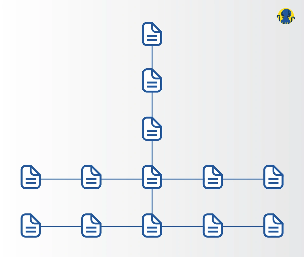
A flat website architecture diagram looks like this:
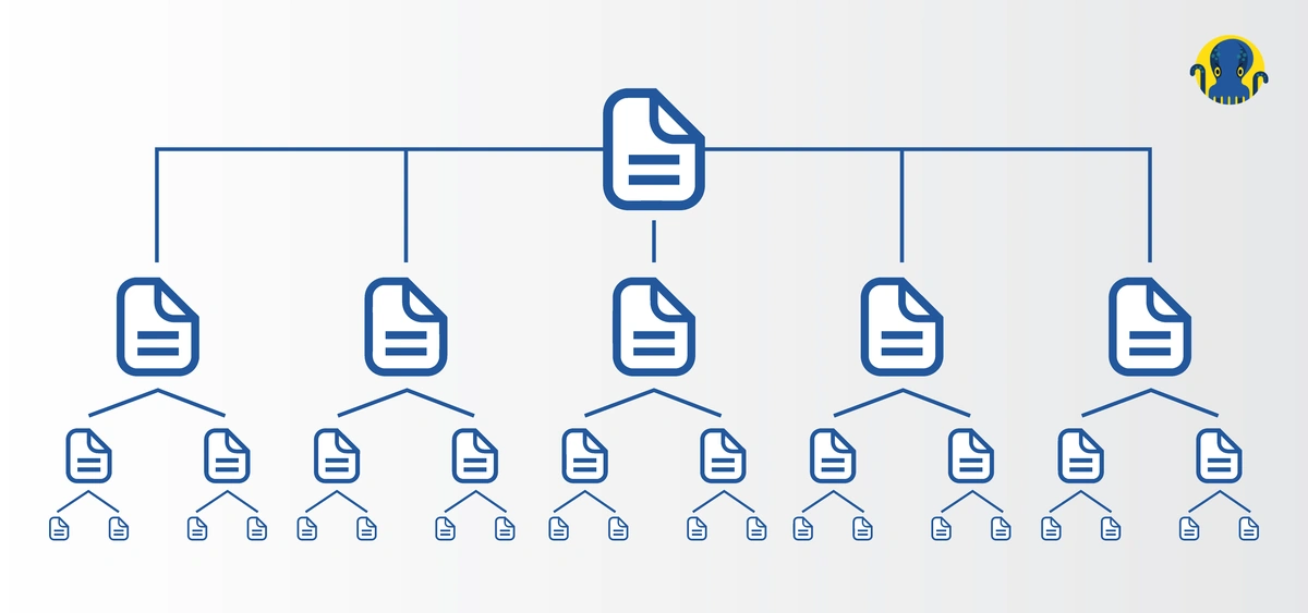
On the other hand, a website with deep architecture typically requires more clicks to reach certain pages. More layers of subcategories hurt the UX.
A deep website structure diagram looks like this:

A flat architecture model is usually better for SEO and UX as it speeds up site navigation. Elaborate eCommerce stores with many subcategories can use faceted navigation to maintain a flat website architecture.
For instance, Target, the eighth-largest retailer in the US, leverages faceted search so you can head directly to the Men’s Polo Shirts category page from anywhere on the website without having to visit unnecessary intermediary category pages like “Men’s Clothing”.

Although, for flat website architecture, especially in eCommerce, proper internal linking is key.
“The most common mistake I see is not properly internally linking product pages to related categories and blogs,” says Matt Jackson, an eCommerce SEO Consultant specializing in eCommerce websites.
“CMS like Shopify tend to have a flat architecture on the product canonical (e.g. domain.com/product/product-url) so they don’t naturally internally link up to any related categories. By using a Metafields solution in Shopify, you can create hierarchical breadcrumbs, as well as logic-based links in other sections, to send internal links to relevant categories and blog posts,” suggests Matt.
Prioritize UX
With website architecture design, your biggest priority should be to enable users to find exactly what they want as quickly as possible. Here are a few tips to do just that.
Rethink Your Top Navigation
Review your top-level navigation to account for any changes in business goals, inventory, or customer behavior.
Adding more top-level categories helps decrease the number of clicks to conversion pages, but don’t add so many that it becomes tedious to go through all the options on the top navigation.
Use a Mega Menu
Mega menus are a kind of expandable menu wherein many options are shown in a two-dimensional dropdown layout. They are a great design solution for showcasing a large number of lower-level pages (such as product catalogs) right from the homepage.
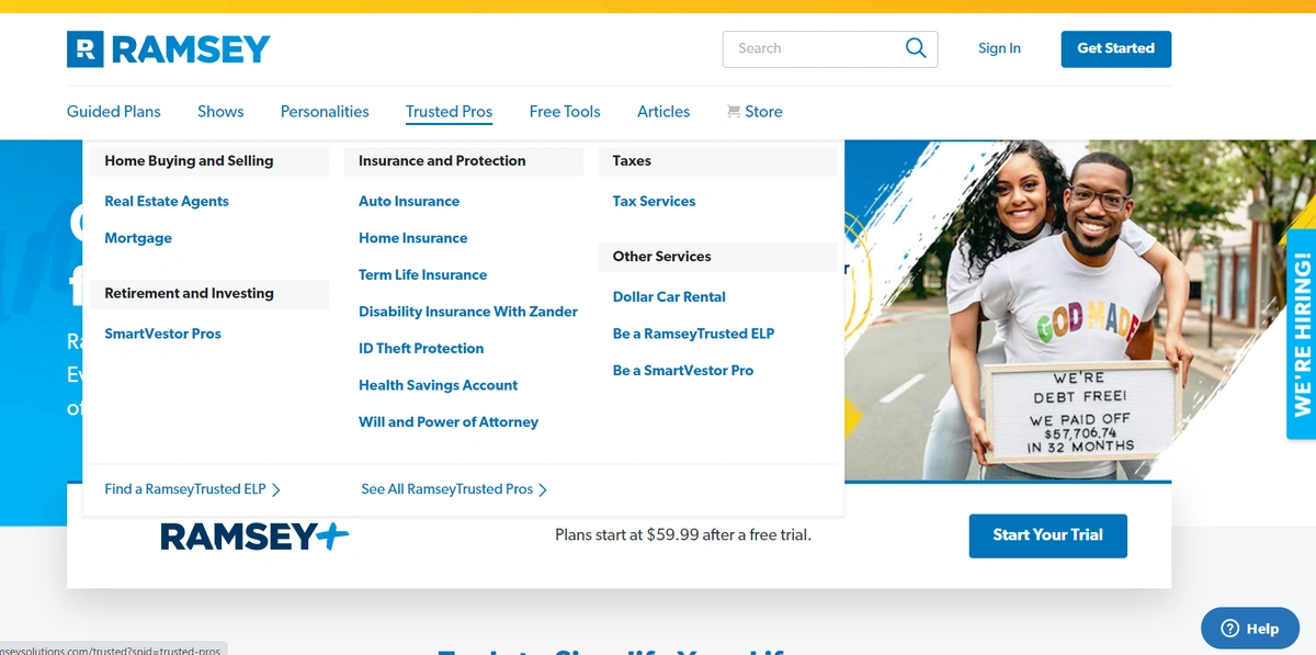
These menus expand into organized lists of pages so the user can quickly find the product category they’re looking for. They can then navigate through layers of subcategories without having to click away from the main menu.
Use Faceted Search
As we touched upon earlier, faceted navigation is a user-friendly way to minimize unnecessary clicks and speed up the website browsing experience.
However, be sure to use faceted navigation correctly. Done incorrectly, it could create other issues such as duplicate content.
“Use faceted navigation wisely: Filters are great for eCommerce sites with lots of products, but they can ruin a good architecture if not implemented properly. It’s best to have filters that are not crawlable to avoid wasting crawl budget and creating duplicate content. If you use URL parameters for your filters, you’ll want to have a canonical link without the parameters. You can see an excellent example of faceted navigation implementation on the REI website,” cautions Charles McLaughlin, SEO Consultant at SEOCharles.

Create a Simple Top-Level Navigation Menu
As we mentioned, adding too many top-level menu options may make it difficult for visitors to use the menu. So, provide as many top-level categories as necessary, but as few as possible.
“KNOW what your good, converting landing pages are, and make sure those are linked to from the main menu. Often, the top-level product category page is NOT a good landing page, as it’s too general (and probably too competitive, and probably doesn’t convert as well), e.g. tvs’ vs. ‘led flat screen tvs’,” suggests Michael Cottam, SEO Consultant

Model Your Website Architecture After the Top Players in Your Industry
Your audience is familiar with the website architecture of the biggest brands in your niche. So, why reinvent the wheel?
For example, if you run an eCommerce store, why not emulate (which means to improve upon, not just copy) Amazon? Your website will instantly become easier to use and navigate.
Keep Your Navigation Consistent
Be it working out or website navigation, consistency is key.
Your website’s navigation format, clickable elements, and design should all follow a consistent theme.
Stelios Kalogeropoulos, SEO Analyst, Journey Further explains:
“Consistency and simplicity help users to navigate websites with greater ease. You don’t have to reinvent the wheel or create navigation with lots of features to captivate your users. Oftentimes, plain navigation performs the best. Think mobile too!”
In fact, website navigation is at the heart of SEO-friendly and scalable website architecture, so let’s look into some…
Page Navigation Best Practices
Page navigational elements, when done right, can support your website’s information flow, helping search engines and users to better understand your pages. Here are a few best practices to get your site navigation right.
Optimize Your URL Structure
Look at this URL:
example.com/running/default.aspx?lang=en&category=29b20
Neither visitors nor crawlers would understand or appreciate it. Keep URLs crisp, clean, and coherent. The URL structure must align with both navigation and breadcrumbs (discussed next) for consistency.
“Communicate the relative importance of a page and its hierarchical position within the site, however, to do so effectively URLs have to be short, concise, accurate, thematically organized within folders and subfolders, free of non-alphanumeric characters, and joined with hyphens,” suggests Stelios on optimizing your URL structure.
“I often see SEOs overdoing it with deep folder structure. Sometimes this is intentional, but other times it’s the result of product feeds on eCommerce sites or poor permalink configurations on blogs. It’s not uncommon to see variations of a keyword in the domain, folder, and slug itself. Even if you’re getting away with this keyword-stuffed URL from an SEO perspective, it looks incredibly spammy for your users,” says Jase Rodley, Founder of Dialed Labs.
“Google notes that users prefer simple URLs, which is why you tend to see shorter, trust inspiring URLs ranking higher,” advises Jase.
Use Breadcrumbs Correctly
Your visitors are likely to look at different options and browse around various products and catalogs.
Breadcrumbs are a standard way to show visitors where they are in your site structure and give them an easy path back to the parent category. Breadcrumbs also provide search engine crawlers more context about your website architecture.
So, have a clearly linked breadcrumb structure above page titles and at the bottom of product pages. See another example from Target below:

“Using breadcrumbs is an easy way to strengthen an eCommerce site architecture and improve navigation for users,” suggests Charles McLaughlin.
“Use breadcrumbs: not only does it help the user, but it helps distribute link juice appropriately to parent category pages so that Google understands the hierarchy of your website. And don’t forget to mark up your breadcrumbs with schema, so they’ll show as rich snippets in the SERPs,” explains Michael Cottam.
“Similar to URLs communicate the connection between pages and allow for ease of navigation. For that reason, breadcrumbs need also be concise and on point without deviating or linking to irrelevant pages as this can greatly confuse both machines and users,” recommends Stelios Kalogeropoulos.
Consider Pagination vs Infinite Scroll
Should you paginate a large list of products or content? Or should you load more products or content as the user scrolls or clicks a “load more” button?
Infinite scroll seems like a good way to avoid clicks and could work well for the mobile version of your site. But pagination allows a greater sense of control, and page numbers help prospects retain an idea of where the product was, so they can navigate back to something they liked.
Most big brands prefer pagination. And so, all in all, infinite scroll should be avoided.
Have Strategic Internal Links
Internal links convey context to search engines through page relevance, link intent, anchor text, and the content around the link. Internal links also pass link equity — aka PageRank — to important, high-converting pages on your website.
So link to your important URLs from other relevant pages frequently. If you already have a link-building strategy in action, don’t forget your internal linking structure.
“Internal linking is an integral part of site structure best practices as it is the stepping stone between pages for both users and search engines. Remember, not all users start from the homepage! Match your anchor text as closely matched to your links theme as possible, avoid redirects, and make sure (when possible) that the surrounding text is reinforcing your link’s subject,” corroborates Stelios Kalogeropoulos.
Use Canonical Tags
From faceted navigation to pagination, implementing all these user-friendly elements demands a double-check on canonical tags so there are no duplicate content issues.
So, ensure all versions of each product page canonicalize to their parent page. Set the parent page as a canonical URL with rel=”canonical” tag to make it the master version of the product page that you’d like to rank in the SERPs. Use absolute (not relative) URLs.
Consider How Your Pages Connect With Each Other
Your most important pages should ideally be reachable within 2-3 clicks from your homepage.
Consider the anchor text you use for each link. The words used in your anchor strongly indicate — to both bots and visitors — context about the page at the other side of the link.
Also, the source page of the link also hints at its importance. Pages linked sitewide, in your sidebar/footer navigation, for instance, can be deemed most important by crawlers as they’re a mere click away from anywhere on your site.
For your content pages, you can implement the pillar-cluster internal linking model.
Create an XML Sitemap
Make it easy for search engines to crawl and index your content. A sitemap is a file that lists all the crawlable pages on your website. It’s crucial for website architecture as it presents your structure in a plain-text, readable, crawlable format.
“Create separate XML sitemaps for different types of pages, e.g. static pages, blog posts, blog category pages, product category pages, product subcategory pages, single product pages, etc. This will enable you to understand where you have indexation problems. See my Moz article on this,” recommends Michael Cottam.
Upgrade Your Website Architecture and Improve Your SEO
Here are a few more ways to further optimize your website architecture for better rankings.
Improve Efficiency and Reduce Wasted Crawl Budget
As we mentioned, create an XML sitemap to help Googlebot understand and crawl your pages readily. Furthermore, create a robots.txt file to let search engines know which sections of your site they aren’t allowed to access.
Also while 301 redirects are often necessary, make sure you don’t have too many redirects set up, as they hurt your crawl budget.
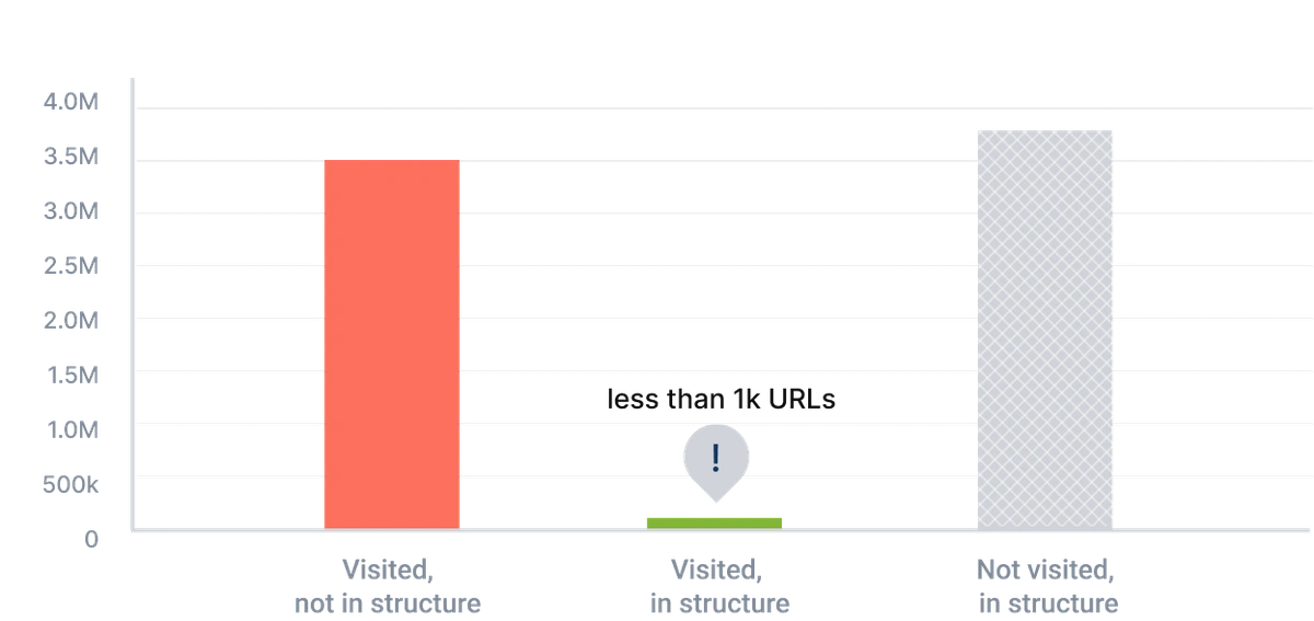
Speaking of crawl budget, it is a significant issue. Instead of focusing on your best ROI-driving pages, Googlebot can often crawl irrelevant or outdated pages. The JetOctopus Log Analyzer not just identifies crawl budget waste but also boosts the number of valuable pages visited by Googlebot.
Address Pages That Appear as Duplicate Content
Duplicate content issues are common, especially in eCommerce.
A common issue that causes duplicate content is when both the www version and non-www version of your site get indexed. Both appear as two different websites to Google. The same can happen for HTTP and HTTPS versions.
Check if your website has multiple such versions and if so, merge them into one with 301 redirects in your .htaccess file. And of course, use rel=”canonical” tags to mark the master versions of your pages that you’d like to rank in the SERPs.
The JetOctopus Log Analyzer also helps fix duplicate pages, check your indexation, and ultimately, optimize your site structure.
Implement the Pillar-Cluster Internal Linking Model
In the pillar-cluster model, you create a parent page (aka the pillar) that serves as a central hub that contextually interlinks with all the child pages (that also link to each other, thus creating a cluster).
This internal linking model makes your website structure coherent and directs crawlers and visitors to relevant pieces of content. As such, when visitors come across an internal link on your site, they should instantly know which piece of content or page the link will lead them to.
Here’s an example of a pillar-cluster model for a blog about workout routines.
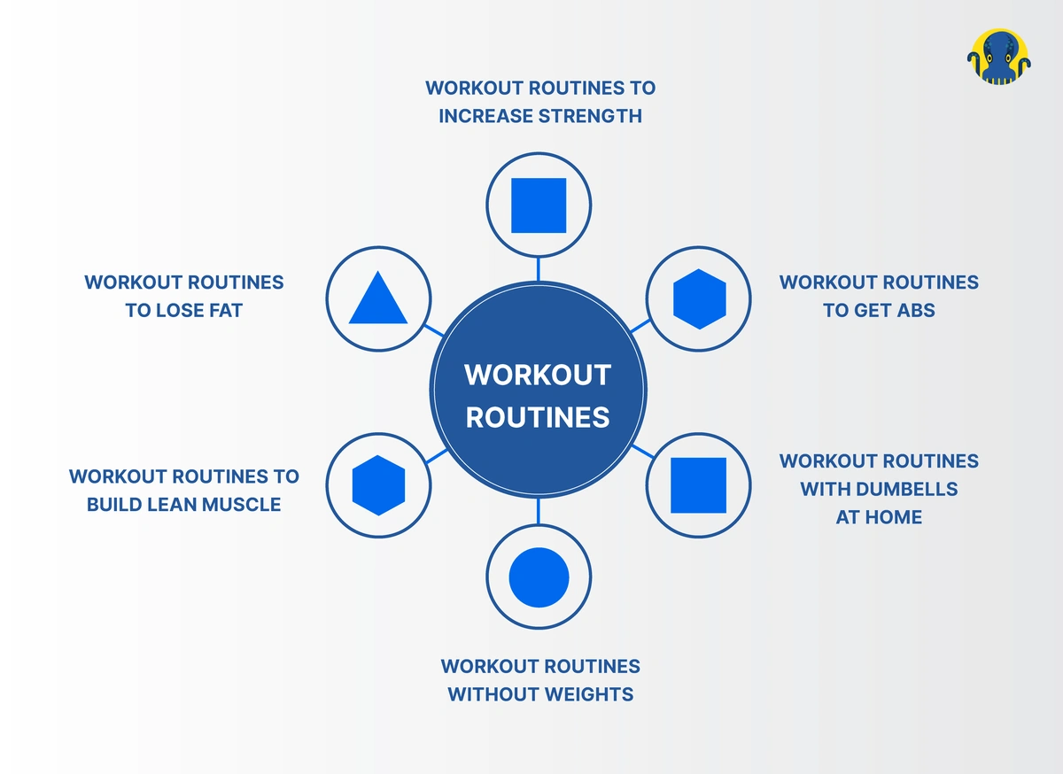
The pillar-cluster model helps reinforce your topical authority.
“I actually recommend reverse engineering your website architecture to gain the best results for SEO. This process will be tightly aligned with your keyword research. You need to decide what pages you would like your website to rank for, choose the relevant content for this, and only then should you decide on your website structure. This allows you to choose the most important topics and importantly decide if you would like physical or virtual content silos. This has a whole host of benefits of SEO including covering topical authority (very important after the BERT update), maximizing your Link Juice flow and importantly, making your content clear and structured for Google to crawl,” recommends Josh Willett, an experienced SEO Consultant and Web Developer.

User intent and keywords also play a big role in developing an effective clustering strategy.
“Advice number one is to check the user intent of keywords and join them together in a cluster when they serve the same purpose.
Not nailing down the user intent while doing keyword research is a killer of eCommerce sites structure. Pages that target mixed user intent confuse Google. It happens when website owners try to optimize their categories and products with search terms that belong to the blog. It is ineffective and hurts the performance of the page. A well-optimized page will rank, but the users’ behavior will drag it down because of different expectations.
For example, imagine looking for trail running advice, but you end up on the eCommerce category page with SEO content hidden in accordion. Are you happy? No, you are most likely leaving,” advises Michał Suski, the co-founder of Surfer SEO.
Examine Technical Site Architecture Elements
Last but not least, look out for any technical issues like server errors, duplicate title or meta tags, orphan pages, hreflang issues, etc. The JetOctopus Crawler is all you need to find and fix these technical site architecture issues.
Common Mistakes in Website Structuring
With all the best practices in front of you, it’s a good idea to also keep in mind some common mistakes people make in structuring their website.
We asked a few SEO experts to share their thoughts on “what are the most common mistakes in website structuring?”, and here’s some top advice we received from them.
Mike Wiseman, an SEO Consultant, answered:
“Planning & executing a website’s structure is a fundamental part of an SEO Strategy. Here are a couple of common mistakes I often see in a website’s structure.
- A Website Silo Structure does not exist
Oftentimes I do not see websites taking advantage of a silo structure. If a website silo structure is planned & executed correctly you will have better, and faster positive movements in your keyword rankings. - Long or complicated URL paths
A benefit of organizing your website’s content is the ability to take advantage of keyword-rich URLs. Don’t go overboard on your URL paths, keep them clean and simple, and try to keep the depth as close to the root domain as possible.”
Martin Wilson, a freelance marketing consultant, answered:
“The most common mistake I see clients and inexperienced web designers/developers make is by not organizing pages into sections (SEO silos) and linking between related pages and back to the parent (hub) page. To rank for highly competitive keywords Google would prefer to serve results linking to pages that have the relevant information, but more so to pages that are surrounded by other pages of unique content that also have related information – this ensures it sends visitors to, if not the main page, but to a page that is in a section where the user will find the information they need.”
David Carralón, Managing Director at Digitalico Media, responded:
“Lack of effective product or audience research conducted. Whether ordinary market research or keyword research for SEO. Especially on the B2B front I still bump into numerous audits where I highlight the need to replace the usual ‘Product’ entity on the top nav for a more user-centric or product-centric line of entities. As a result of this missing element, many sites do not benefit from coherent silo structure in their line of products, and that usually impacts SEO negatively.”

“Poor categorization: Most of the time, there are several ways to structure a website. In terms of SEO potential, these different ways are rarely equal. A common mistake companies make is they think about SEO after making their site, which often results in missed opportunities. SEO should be part of the conversation before the website is built,” replies Charles McLaughlin.
“Not optimizing the architecture as your site grows: New opportunities present themselves to add categories or subcategories as you add more pages to a site. Most companies pile new content under their initial site structure without ever considering the opportunities to optimize it. Addressing this can benefit not only your SEO but your user experience as well,” explains Charles.
Dave Davies, Chief Executive Officer, Beanstalk Internet Marketing
“Probably the biggest mistake I see from an SEO perspective arises when site owners fall into the false promise of improving an experience by reducing the clicks to what THEY want. This is the principle behind mega-mega-mega menus and the brutal dilution of PageRank. A nightmare for search engines and users alike. A site should generally be structured with PageRank flowing to the most important pages (which generally target higher competition terms). This also funnels users down the same path.”
Here’s a detailed answer to our question from Yaser Ayub, Founder, Yaser UK:
“1) Number one mistake that I see in structuring is when websites don’t have a specific target topic, and instead are vague in their proposition and services. Every business should ensure that each page has a key focus topic that they’re talking about.
For example, I specialize in SEO and Fintech, and my website structure is based on these two specific topics.
Essentially, your website structure should reflect your company goals. We want to rank for Fintech and SEO, we want people to look for these topics and for customers to come to our website and find exactly what they’re looking for. We structure the website based on a particular topic and specialty of ours, which increases our quality traffic.
2) In website structuring, keywords in the URL are essential! It is essential for SEO and it gives a clear indication of the website structure.
3) Pages need to be indexed regularly so that Google has a clear image of your whole website and its new updates.”
Michał Suski also shared his thoughts on the common mistakes people make in website structuring:
“The most common issue is related to the most common source of the problem. In this case, it is the default WordPress structure. WordPress is the most common CMS on the Internet. Then it makes its settings cause the most common problems, logical, huh? Let’s get to the point—the thin content. A thin content page characteristics are:
- no unique content
- not beneficial to either the visitor or Googlebot
These pages are populated automatically in WordPress because of Tags, Categories, and Author Pages. But unfortunately, they turn out to be listicles of posts that bring no value, waste crawl budget, and fill the index with dozens of useless pages.
You can get rid of these pages by installing one of the plugins, e.g., Rank Math. But the most important fix is to know the purpose of tag, category, or author pages. Make them unique. Instead of a standard list of posts created by an author, build a custom page with a bio, external links to resources, and a photo. It will become not only a quality page but also a strong EAT signal.”
Last but not least, Michael Cottam also provided an in-depth answer to our question:
“Three mistakes that I see people make all the time:
#1 Not structuring their main menu so that link juice flows to all of their key landing pages. As an example, they might have a menu that includes a link to their product page, but not to the products themselves. The products page then is the ONLY page on the site that sends link juice to those landing pages. Instead, they should turn that product menu option into a pulldown, with links to the products themselves. In that way, EVERY page on the site sends link juice to those product pages. On moderately large e-com sites, their menu might link to their major product categories, but there’s no link juice from the menu flowing to the subcategories, which really are the landing pages.
#2 Repeating their main menu links in the footer. Footer links flow almost no link juice compared to other links on the page, yet they dilute the link juice from the page that might flow to the links from the main menu. Alex Stein, when he was at Wayfair, did a MozCon talk on how they improved link juice flow and saw rankings improvements just by cleaning up some redundant footer links.
#3 Not handling multiple languages correctly. If your website has versions of pages in different languages, you’ve got to get both your hreflang statements and your rel canonical statements correct. Often people will neglect to include the hreflang for the language that the page itself is in, and only reference the other versions. Also, I see people who will set the rel canonical in all of the other language versions to the English page. It’s not really all that complicated—Google describes how to do it correctly here.”
Final Thoughts
Building an SEO-friendly website architecture may seem like a one-and-done deal, but it’s not.
As your business grows, your website is likely to have more pages, products, categories, etc. added to it — you need to take them into account and continually update your site structure so you don’t fall victim to issues like broken links, empty categories, duplicate content, etc.
To wrap up, your website architecture plays a huge role in both UX and SEO. With a user-friendly website architecture, you’ll boost your average session duration and encourage visitors to engage with your content. In turn, this leads to better rankings and conversions.


